SaaS Onboarding UX: Patterns That Convert
Covers the core SaaS onboarding UX patterns: the activation moment framework, progressive disclosure, empty state design, onboarding checklists vs interactive tours, email sequence timing, and the specific design decisions that separate high-converting onboarding from onboarding that loses users before they see value.
SaaS Onboarding UX: Patterns That Convert
SaaS onboarding is the sequence of UI, email, and in-app interactions that moves a new user from account creation to their first experience of the product's core value — the activation moment. Onboarding UX determines whether the 60–80% of users who sign up for a SaaS trial but never activate become paying customers or churn silently. The difference between 15% and 40% trial-to-paid conversion is almost entirely determined by how quickly and clearly the product delivers its first value moment.
The Activation Moment: The Only Metric That Matters in Onboarding
The activation moment is the specific in-product action that correlates most strongly with long-term retention:
- Project management tool: creating and assigning the first task
- Document processing tool: successfully processing the first document
- CRM: importing contacts and logging the first activity
- Team communication tool: sending the first message to a teammate
Every onboarding design decision should be evaluated against one criterion: does this get more users to the activation moment faster?
If you don't know your activation moment — the specific action that distinguishes retained users from churned users — identify it before redesigning your onboarding. Pull cohort data, find the action retained users almost always took in their first session that churned users didn't.
Pattern 1: The Minimum Viable Signup
Every field on your signup form is a reason to abandon it. Collect only what you technically need to create the account: email and password (or OAuth). That's it.
Everything else — company size, role, use case — can be collected progressively after the user has seen enough value to be willing to answer. The activation rate lift from reducing signup fields from 8 to 2 is consistently 20–40% in A/B tests across SaaS products.
Pattern 2: The Empty State as Onboarding
The first thing most new users see after signup is an empty dashboard with no data, no context, no guidance. This is the highest-risk moment in onboarding.
An empty state should: communicate what the space will contain when populated, provide a clear primary action to start populating it, and optionally provide sample data showing the product in use.
Pre-populating sample data is the fastest way to show a new user what the product looks like. Tools like Notion, Linear, and Airtable all use this pattern — the user's first session shows them a populated workspace, not an empty one.
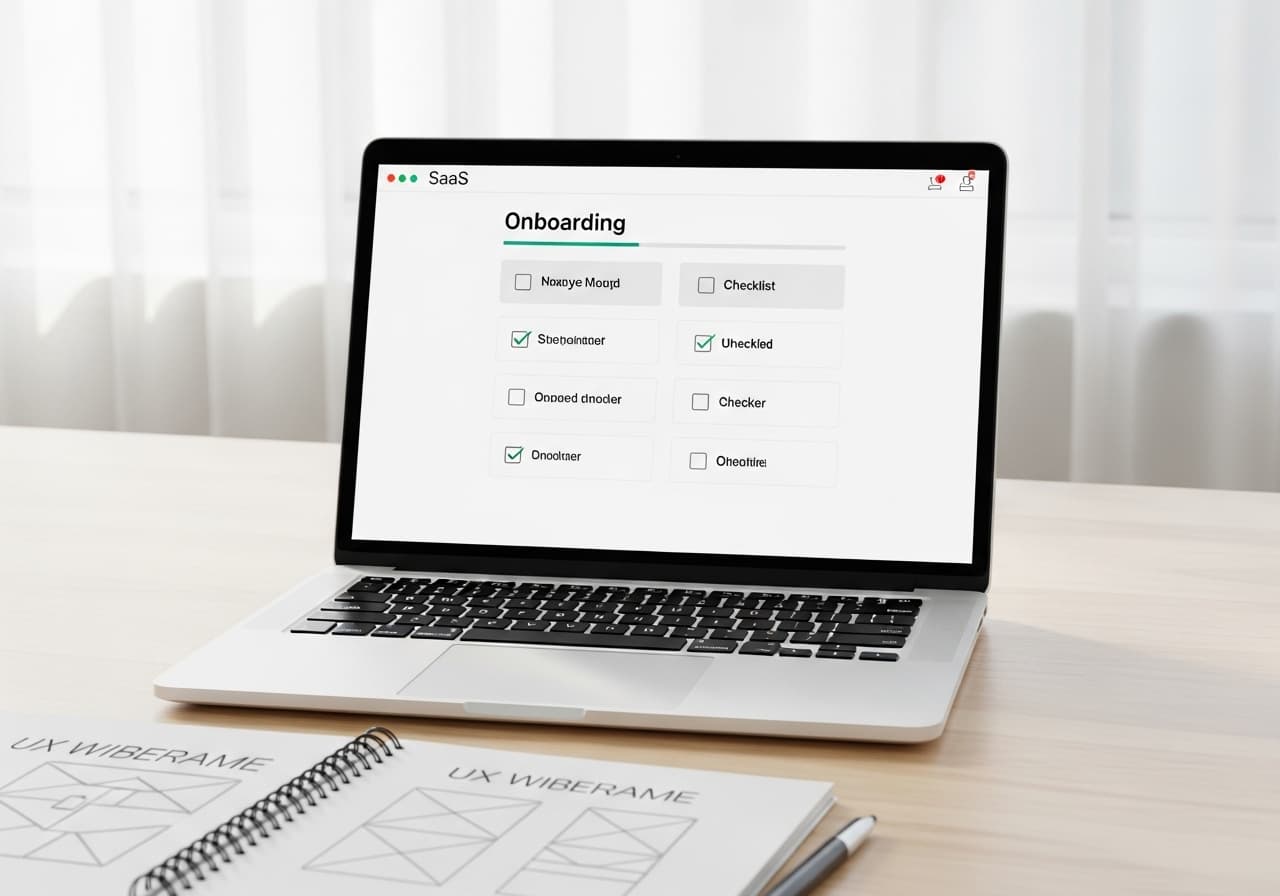
Pattern 3: Onboarding Checklists vs Interactive Tours
Interactive product tours (tooltips walking through the UI): effective for products with a simple, linear activation path. Forces a single path, which is a problem if users have multiple natural starting points.
Onboarding checklists (persistent checklist of key setup tasks with progress tracking): effective for products where activation requires multiple setup steps in any order, or where the product has depth requiring more than one session to explore.
The best checklists: 4–6 items maximum, each is a specific action (not "explore the dashboard" — "create your first report"), each shows a clear completion state, and the checklist is dismissible after a threshold of items are completed.
Pattern 4: Progressive Disclosure
Show users only what they need for their current task. Surface the 20% of features that 80% of users need first, reveal advanced features as engagement depth increases.
In practice: a simplified navigation for new users that expands as they complete key actions, advanced settings hidden behind an "Advanced" toggle, and contextual feature education that surfaces when a user takes an action that would benefit from an advanced feature they haven't discovered yet.
Pattern 5: Onboarding Email Sequences
A high-converting onboarding email sequence:
Day 0, immediately after signup: Welcome email with one clear next action — a single CTA linking directly to the relevant in-app page.
Day 1, if not yet activated: "Here's how [Product Name] solves [specific pain point]" — one concrete use case with a 60-second video or GIF showing the activation workflow in action.
Day 3, if not yet activated: Social proof email — a brief customer story or metric with a CTA to a free setup call or template that makes activation easier.
Day 7, if still not activated: Direct offer — a discount, extended trial, or concierge onboarding. This email converts users who wanted to try the product but got stuck on setup.
Stop emailing after day 10 if there's still no activation — continued emails are more likely to generate spam reports than conversions.
Measuring Onboarding: The Metrics That Matter
Activation rate: % of signups who reach the activation moment within 7 days. Benchmark: 20–40% for B2B SaaS. Below 15% indicates a broken onboarding path.
Time to activation: How long between signup and first activation moment. Faster is better — users who activate within their first session retain at higher rates.
Trial-to-paid conversion: % of trials who convert to paid. Benchmark: 15–25% for self-serve B2B SaaS. Below 10% usually indicates an onboarding problem.
For full-stack SaaS implementation including onboarding flow, Stripe billing, and RBAC, see Magehire's B2B SaaS development service.
Ready to Build Onboarding That Actually Converts?
Most SaaS onboarding is designed around what the product does, not around getting users to value. Magehire builds onboarding flows around the activation moment from the first sprint. Schedule a strategy session to design onboarding that converts.
?Frequently Asked Questions
Keep Reading
Explore more insights from our team
How to Automate Business Processes With LLMs in 2026
Step-by-step framework for identifying which business processes are LLM-automatable, designing the pipeline architecture, selecting orchestration tools (LangChain, n8n, custom), and building validation layers that make outputs production-safe.

How to Build an MVP Without a Technical Cofounder
Covers the four realistic paths for non-technical founders to build an MVP (no-code, low-code, freelancer, agency), how to evaluate each by scope and budget, how to avoid the most common mistakes, and what to look for when hiring technical help without being able to evaluate the code yourself.
Scale Your Project
Ready to build high-performance software? Our experts in New York handle the technical heavy lifting so you can focus on growth.
Get a Free Consultation